Logo design for HitchStan Arkitektur
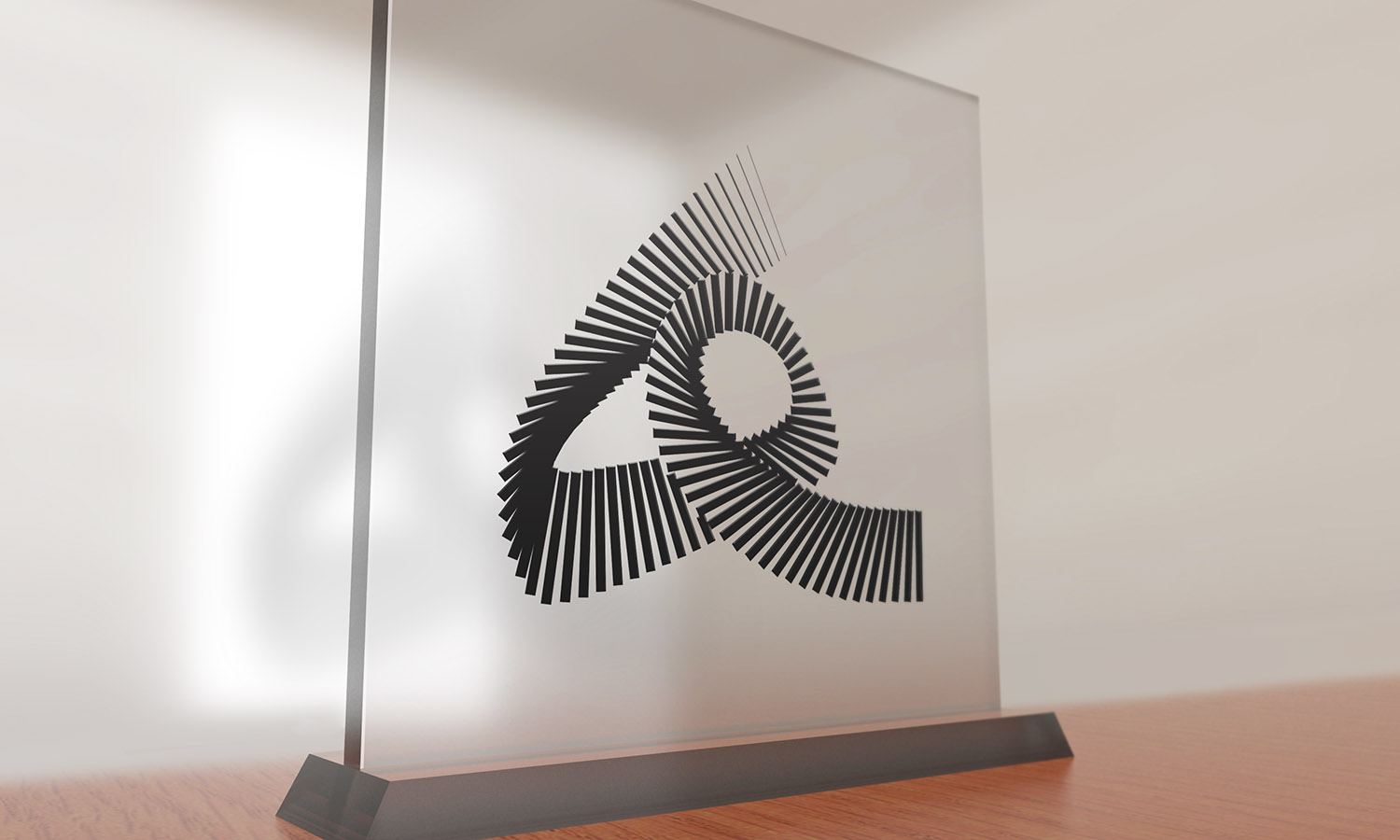
The following work is a logo designed for HitchStan Arkitektur. HitchStan is a Swedish architecture company located in Stockholm, which is professionally involved with architectural and urban design.
HitchStan’s professional working branch had a crucial role in the design of their logo. Inasmuch as they work with architectural design and urban projects, all which require step by step design, development, and construction; together with HitchStan we tried to reflect the mentioned concepts in the design of the logo.
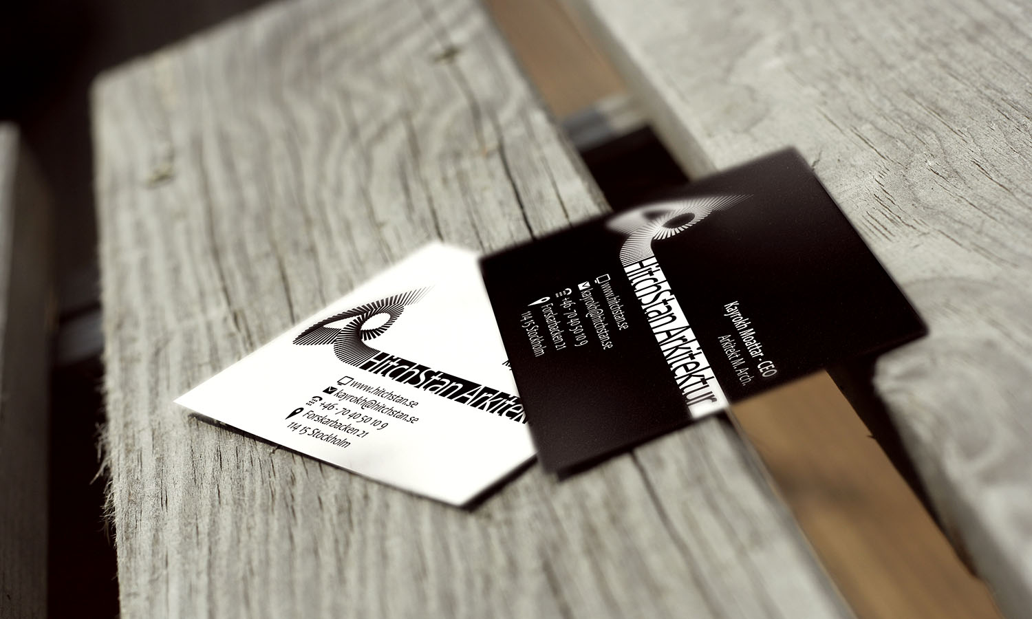
Specific form of the logo is inspired by the equivalent of letter “H” in Persian language (هـ), which bears great graphical characteristics. HitchStan /heechéstaan/ is originally a Persian word meaning “a place in which nothing exists”. This verbal irony is symbolized through the repetition of constructing lines of the logo which gradually lose their visual weight and finally fade. Moreover, a lot of thoughts are applied in the design process, to enhance HitchStan’s visual corporate identity. In the following pictures, you can see a combination of the logo, and their logotype together in a business card layout which is also designed by Tiny Little Monsters. Follow HitchStan on Facebook
Read also about our responsive web design project for HitchStan
