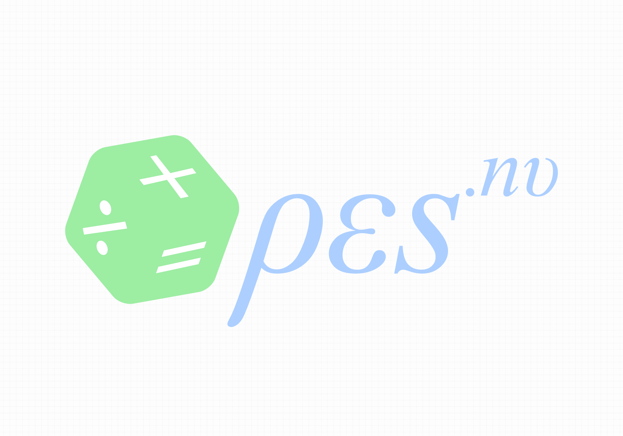
Logo design for PES.nu
PES objective is to provide high quality educational services in the form of private classes and homework help for students who have difficulty in learning mathematics and physics.
Knowing that the client's main marketing chanell would be their website, we decided to represent the full website address (pes.nu) visually in the logo. This way, their customers would remember the domain more easily, having looked at the logotype.
Alos, as the institute's main audience are students, we tried to design a logo with some playfulness and friendliness. Additionally, the client's main area of work which is teaching mathematics and physics, made us reflect these abstract notions using something that these two branches have in common: "formulas". That is why the typography of the logotype looks like a formula.
