Logotype design for Sökordsspecialisten
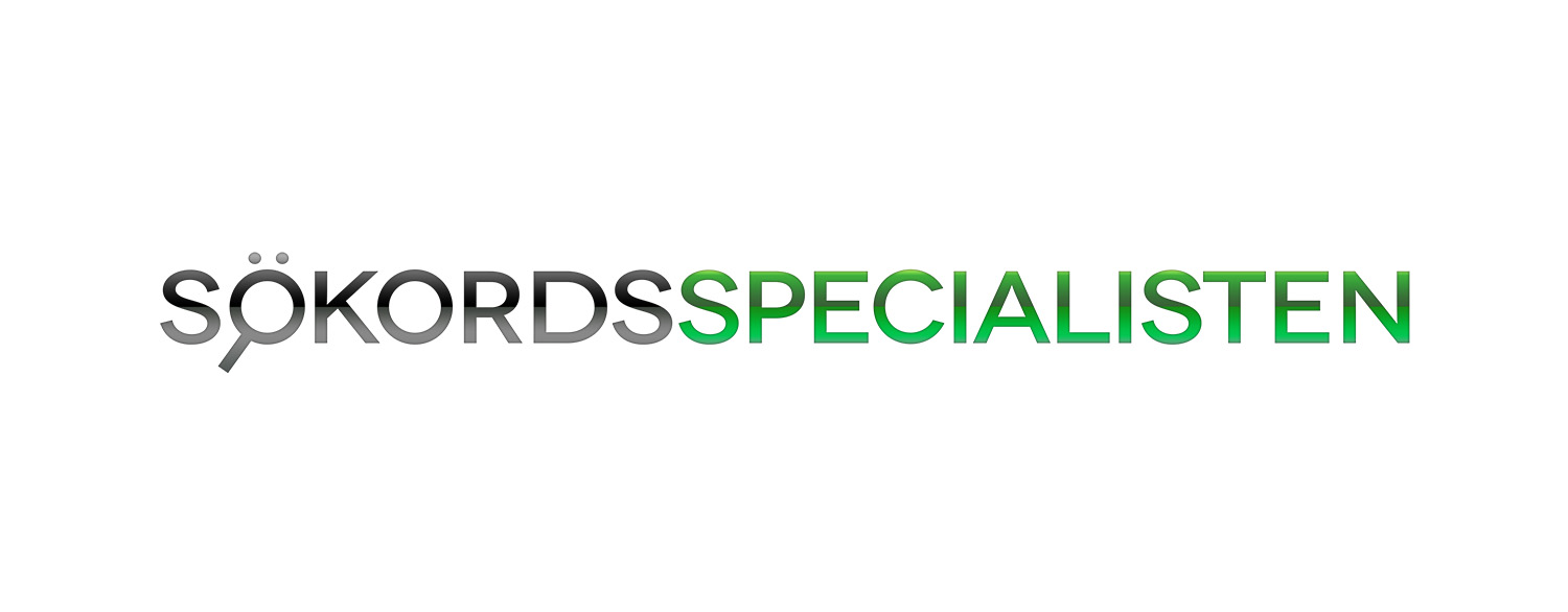
The following work is a slick logotype designed for a Swedish company located in Malmö, namely Sökordsspecialisten; which is involved with a variety of services related to marketing via search engines and search engine optimization. Design of the logotype aims to illustrate a professional, serious, and secure image for the company. In addition, simplicity, and having a clean look were main focuses in the design of this project.
‘Sök’ in Swedish language means ‘search’ and ‘Sökord’ means ‘keyword’ (literally: search word); and Sökordsspecialisten can be translated to ‘The Keyword Specialist’. Considering the meaning of the name, the delicate visual play in the design of the logotype turns meaningful. A silhouette form of a magnifying glass, is combined with and accompanies the word ‘Sök’, which symbolizes the notion of searching on the internet. Yet, the logotype is kept simple and holds together very well due to avoiding unnecessary details. This characteristic makes the logotype highly compatible for both digital display, and printing proposes in large and small scales.
Read more about the website design project for Sökordsspecialisten, also done by us.
